Why every dumb phone app for iPhone looks the same
I wanted a dumb phone. Buying one was the wrong move and so was every app pretending to be one, so I spent twenty days rebuilding the phone instead.
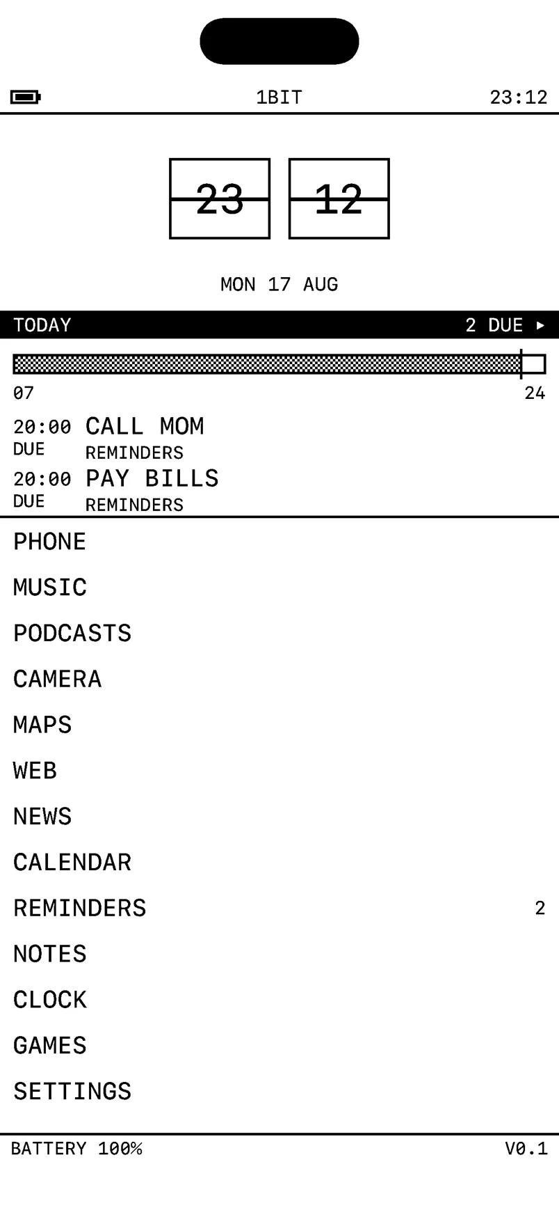
Every dumb phone app for iPhone looks the same because Apple doesn’t allow anything else. The App Store rejects “apps that create alternate desktop/home screen environments” (guideline 2.5.8), so a minimalist launcher can only be a home-screen widget with a text list on it, and tapping a row opens the normal app. That’s also why most of them don’t cut your screen time: the list is calmer, but the music app, the news feed and the browser behind it are exactly as they were.
To build one that works, you have to rebuild those destinations yourself. That’s what we did with 1bit, our dumb phone app for iPhone, so weigh what follows knowing it’s ours. This is the build log.
I wanted a dumb phone. Then I priced the ones worth having, worked out they cost roughly what a used iPhone does, and realised I’d still be carrying the iPhone anyway for maps and the bank app. Buying my way out was going to leave me with two phones and no less screen time.
So I looked at the apps instead. Every minimalist launcher on iOS is the same object: a black screen with a text list on it, in a nice font. It makes a great screenshot.
It’s also a menu. The moment you tap MUSIC, you’re in Spotify. Tap NEWS and you’re in whatever infinite feed you had before. The app has changed the door and left the room exactly as it was. I tried two of them. My screen time did not move.
iOS won’t let you replace SpringBoard, and it never will. But nothing stops you owning the destination. That’s the whole product: not the list, the fourteen things the list points at.
So I built them. Phone, texts, music, podcasts, camera, maps, web, news, calendar, reminders, notes, clock, games, settings. 444 commits, 77,503 lines of Swift, twenty days. Here’s the part that’s worth stealing.
The browser is where the fight actually is
Everything else on that list is a solved problem you just have to sit down and do. The browser is the one that decides whether the app works, because the browser is where the pull lives. You can put a two-colour skin on a music player all day; if the web arrives in full colour with autoplay video in it, you’ve built a themed launcher.
WebKit isn’t optional. Guideline 2.5.6 requires it for anything that browses, everywhere except the EU and Japan, so WKWebView was the engine before I had an opinion. What it gives you in return is WKContentRuleList, WKUserScript and WKScriptMessageHandler, and those three are enough.
Scripts are off by default. Every site, allowsContentJavaScript = false, opted back in per host from a SCRIPTS cell in the control strip and remembered. That single line removes most ads, most trackers, most modals, most cookie walls, and most of what makes a page behave like a slot machine. It is by a distance the highest-leverage thing in the app, and it costs one boolean.
It also breaks things, which is why the toggle is a cell on the strip and not buried three screens into settings. Turning scripts on for your bank and leaving them off for everything else takes one tap and sticks per host. Friction where you want it, none where you don’t.
No tabs. Leaving the browser drops the live WebKit page and remembers its URL, so coming back rebuilds the last site instead of resetting. A tab strip is a stack of open loops you carry around, and the whole point was to stop carrying open loops.
No image arrives as itself. This is the piece I’m happiest with. A content rule blocks resource-type: ["image"] outright, so the phone never downloads the two-megapixel JPEG. A document-start script reads each <img>’s src, data-src and srcset — the attributes survive, only the load was refused — and posts the address to Swift. Swift fetches it, runs it through the same Bayer dither grid the camera uses, 240 cells wide, and hands back a data:image/png of a few kilobytes with image-rendering: pixelated on it.
The status line tells you what that cost: how many pictures were reduced and how many bytes it saved. Reddit becomes legible. Every photo on the web arrives looking like it was printed in a 1987 newspaper, and I have not once wanted the colour version back.
Two things I got wrong here
I rewrote canonical hosts to their mobile versions. en.wikipedia.org to en.m.wikipedia.org, on the theory that the lite host is lighter. Wikimedia retired that host years ago and now redirects en.m back to en., so every Wikipedia link and every search went into an infinite loop, and it looked like a WebKit bug for an embarrassingly long time. The commit is Revert Lite/Mobile sites fix endless wikipedia loop. Load the address the site wrote. Choosing a search engine is your call; rewriting a navigation the site started is not.
The mill had no rate limit. A message handler that starts a Task per message has no rate at all. A Reddit feed reported 170 pictures, so the app started 170 downloads and 170 dithers, and the peak was every source’s bytes standing in memory together. Freeze, then termination, with nothing in the app’s own log to show for it. That is what a memory-pressure kill looks like from the inside, and it sent me looking at WebKit for a while before I looked at my own queue.
Decoding each image smaller was necessary and not sufficient. The fix is a counting semaphore, six at a time, with the waiters as continuations on an actor rather than threads parked on a DispatchSemaphore. Park enough of those and the cooperative pool has no thread left to finish the work on.
NOTE // If a page can hand your app an unbounded list of anything, the bound goes at the point of consumption, not at the point of decode. Making each unit cheaper just raises the number of units it takes to kill you.
The camera develops film
The camera writes a black-and-white photograph, and the tone curve is a real one. A “film look” here is four numbers and a grain amplitude: where the levels crush, how hard the curve bends towards a full S, what the output floor is (the milky shadows of a print pulled off a thin negative), and how big one clump of grain is. There are four — FLAT, NOUVELLE, STOCK 400, NOIR — and a hidden fifth.
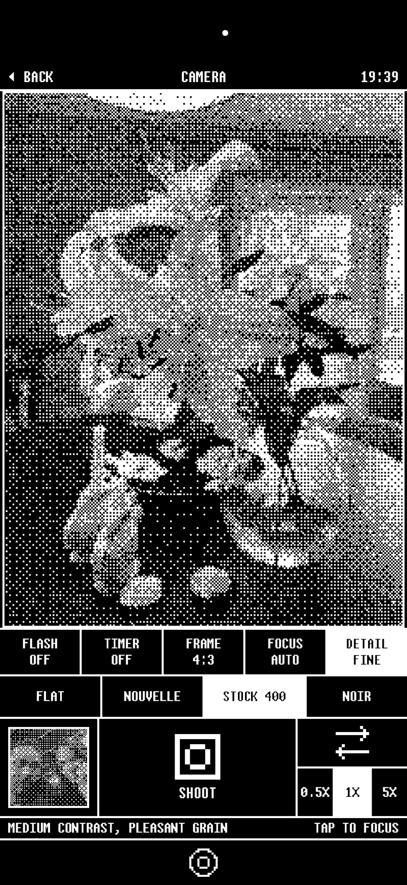
The curve is a 256-entry lookup table, because tone mapping is per-look work and a twelve-megapixel frame is not where you want to find that out. The grain is seeded from pixel coordinates rather than a random walk, so developing the same frame twice gives you the same photograph.
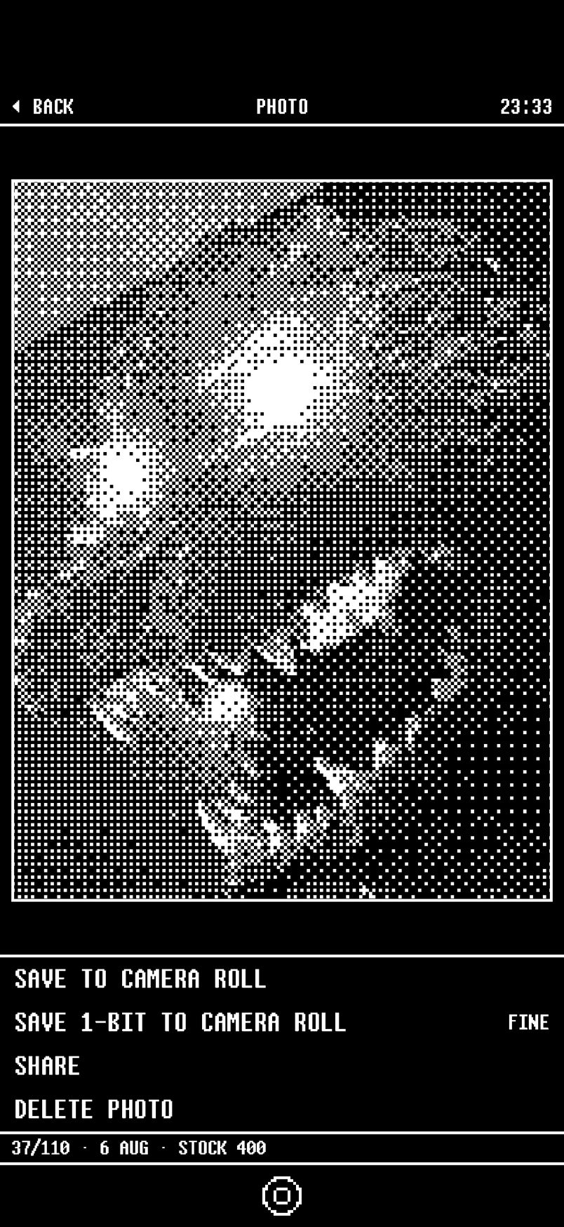
Then there’s a save 1-bit to camera roll action, which is the one people react to. The dithered version goes into the system photo library as an ordinary image, so the pictures leave the app and turn up in Photos beside everything else, already developed.
The hidden fifth look is a toy camera, pushed over the main one: 128×112 pixels, four tones, a viewfinder you can barely compose in. It taught me the actual lesson of this project. Taking a photo you can’t quite see is more fun than taking a perfect one, and the reason is that you’re doing something to the camera rather than through it.
The bug there is my favourite in the repo. The toy camera’s four tones are each drawn as a dither pattern, and every screen in the app dithers photographs on the way past. So its pictures were being dithered twice, one ordered grid landing on top of another, and every face came out as static. Two fixes: the toy roll is its own album that nothing re-dithers, and quantising into those four levels takes the nearest one instead of thresholding against the grid again. Wherever a shade is said by a pattern, deciding which shade must not be a pattern too.
RSS, and an opinion about feeds
News is a plain old feed reader. Feeds, stories, story, unread marks, one parser covering RSS 2.0, RSS 1.0 and Atom. It grew out of the browser: every page you visit gets probed for a feed, and if there’s one, a single row appears offering to subscribe.
That probe has four tiers, in descending order of how much the site actually said, and only the last two cost a request: the document being a feed, the head announcing one, a feed-shaped link in the body, and the conventional addresses at the host root. Trusting only the announced tier found nothing on plenty of sites that publish a feed, and left anyone who’d followed an RSS link staring at raw XML with nothing to press.
Only ever one feed is offered. List them all and you’ve built a feed manager instead of a browser.
The opinionated bit is the starter shelf, which is two shelves. THE PAPERS is NPR, ProPublica, the Guardian, BBC, NRK. SLOWER is Wait But Why, The Marginalian, Longreads, Quanta, Nautilus, Atlas Obscura, 99% Invisible. A feed that refills every few minutes is unfinishable by design, and one screen can’t both hide that and pretend the news doesn’t exist. So the two kinds sit apart and you choose which one you’re opening.
The click wheel, and why the obsolete parts won
Music has an optional wheel mode that puts an iPod click wheel under every screen in the section. It’s a real one: 12 degrees of travel per detent, thirty clicks to a revolution, five degrees of slop before a touch stops being a press and becomes a turn, and the travel left over between clicks is carried so a slow drag still reaches a detent. Throw it and clicks weight up to six apiece. The rim draws 24 notches rather than one per click, because at that size one per click is a grey blur.
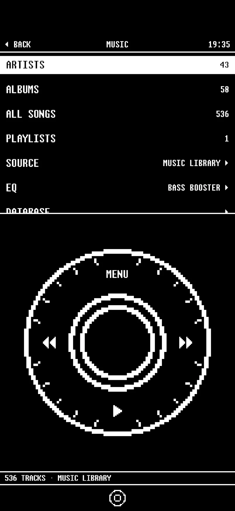
You can also pick your font. Six public-domain unscii bitmap faces ship with it, swappable in settings, and they’re carried into web pages too — the browser injects the chosen face as a data-URI @font-face and forces every page to 16px or 32px, because those are whole multiples of both unscii cells and a bitmap face off the pixel grid looks like mud.
None of that is necessary. All of it is why the app is nice to use.
That’s the thing I didn’t expect going in. I assumed calm came from subtraction, and it mostly doesn’t. Scrolling a library with your thumb on a wheel, hearing it tick, is better than scrolling it with a flick, and not because it’s faster. Taking a photo on a viewfinder you can barely read is better than taking one on a good camera. We’ve optimised the friction out of every interaction we have with these devices and quietly lost the part where it felt like you were operating something. Putting a bit of it back doesn’t make the phone worse. It makes you feel closer to it.
The widgets are half the product
This is where it stops being an app and starts being a phone.
Four home-screen widgets — the launcher itself, a clock, Today, and a single button — plus three Live Activities. Set the phone up with one page holding a full-size launcher widget on a black wallpaper, everything else in the App Library, grayscale on, and it boots into a black-and-white text list. That’s not a metaphor for a dumb phone. That’s what the phone does now.
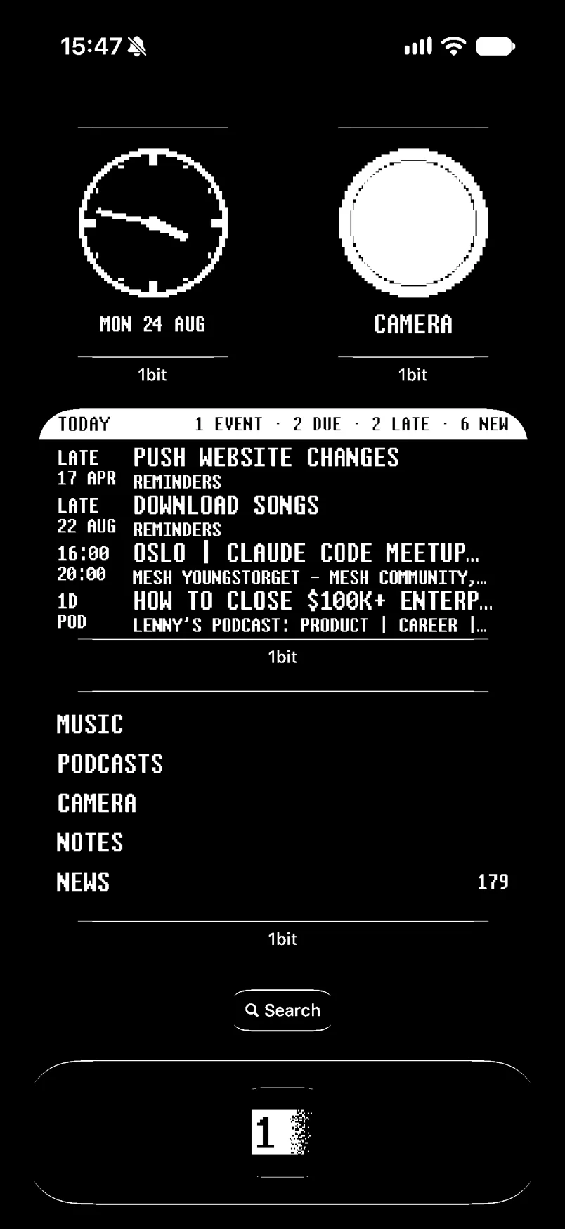
Widgets are also where you find out the extension is not your app. It’s measured in the extension, then archived and drawn by a system process, which has consequences that all bite the same way:
- Fonts are named, never handed over as an object. A built
CTFonthas nothing to resolve against out there, so every card was measured at unscii’s narrow advance and painted in the system face. Labels overflowed and got cut mid-word.Font.custom(_:fixedSize:)resolves the PostScript name out of the extension’s ownInfo.plist. - There is no
Canvas. No live drawing context, so everything isShapeandText. - Row heights are measured, not looked up by family. A
systemMediumis a different number of points on a 15 mini and a 17 Pro Max, and a Today line is 16 points tall in an 8×8 face at the smallest step and 47 in the system monospace at the largest. Every one of them had been given 34. Aframe(height:)doesn’t clip what outgrows it, it centres it and draws it over the line below.
And the widgets never decide anything. The app writes one JSON file into the app group holding the rows the launcher would draw and the lines Today would say, already worked out into strings. The widget picks from it. A widget that computed its own Today panel would be a second implementation disagreeing with the first, and the extension can’t hold the permissions to do it anyway.
What it costs
Some walls are real and stay real. You can’t intercept the home gesture, read iMessage threads, place a call without a confirmation, read call history, or draw turn-by-turn navigation inside your own app. Those four hand off to the system with one tap and there’s no clever workaround coming.
Everything else was allowed. That’s the honest headline: the constraint that killed the idea of an iOS dumb phone was never the API surface. It was that nobody wanted to write fourteen apps.
The rules
If you’re building something in this shape, these are the four I’d hand over:
- Own the destination, not the door. A launcher that hands off to the App Store’s apps has changed nothing. The value is entirely in what you rebuilt.
- Put the escape hatch on the surface. Scripts off by default is only tolerable because turning them on for one site is one visible tap. Defaults that can’t be overridden fast get the whole app deleted.
- Bound the work at consumption, not at cost. Any list a remote page controls needs a gate. Making each item cheaper only changes the number of items required to kill you.
- Friction is a feature, in the places you choose it. The wheel, the four-tone viewfinder, the finishable feed. None of them were necessary and all of them are why it’s good.
FAQ
Can you replace the home screen on an iPhone? No. Apple’s review guidelines reject alternate home screen apps, and the EU’s Digital Markets Act rules, which opened up default browsers, navigation apps and a few other categories, didn’t change that. The closest you can get is a home screen page holding one big widget.
How do dumb phone apps work on iPhone? They’re widgets: a text list you place on your home screen, where each row opens another app through Shortcuts or a link. Some also block apps using Apple’s Screen Time controls. In 1bit the rows open 1bit’s own screens instead.
Do minimalist launchers actually reduce screen time? The ones that only link out mostly don’t. I tried two and my screen time didn’t move, and the results these apps publish are customer testimonials, not studies. What helps is changing what’s behind the tap, or blocking the app outright.
Is there a built-in dumb phone mode on iPhone? The closest is Assistive Access (iOS 17 and later), a simplified mode with large buttons for calls, camera, messages, music and photos. It’s free and worth ten minutes before you pay for anything.
Is a dumb phone app as good as a Light Phone? Not if what you need is a phone that physically can’t run Instagram. A Light Phone III costs $799 or more as of 2026, and that hard wall is the point of it. An app is a wall you can climb over, so for some people the honest answer is to buy the hardware. If you’d rather try it on the phone you have first, 1bit is free for 14 days, then $14.99 once, with no subscription.
We build iOS apps like this at Tennnis. If you’ve got one that needs building, get in touch.